What if buying shoes online actually got your size right?
Fit-tech · Sportswear · Mobile UX
A major sportswear brand needed a shoe-fitting solution inside the Virtusize widget — before summer sales. Virtusize already handled clothing. Different shoe types were uncharted territory, and it was going to be for a global audience of more than 300 million users across 50 countries.
Timeline
April 2024 - July 2024
Team
1 Lead, 1 Designer & 1 Developer
Role
Lead Designer
Skills
Figma, Cross-functional Communication
The Real Problem (It Wasn't the UI)
Before opening Figma, I noticed something that made me uncomfortable: we were building for clients, not for users. In every feature kickoff I'd been part of, the end user's voice was basically absent.
So I did something that wasn't in the brief. I ran my own research: 10 usability interviews across English and Japanese speakers, plus bilingual surveys via SurveyMonkey. Single mothers, students, professionals. Real people who buy shoes online and have strong feelings about it.
"I know I'm a size 7. I buy a size 7. It still doesn't fit."
The insight that changed everything: standard shoe size is essentially fiction. Brand inconsistencies, category differences (a sandal fits nothing like a boot, obviously), foot shape being completely ignored — people weren't struggling to find their size. They'd already given up and gone back to shopping in-store.
That was the real problem. And it had nothing to do with what the brief said.
The Hard Part
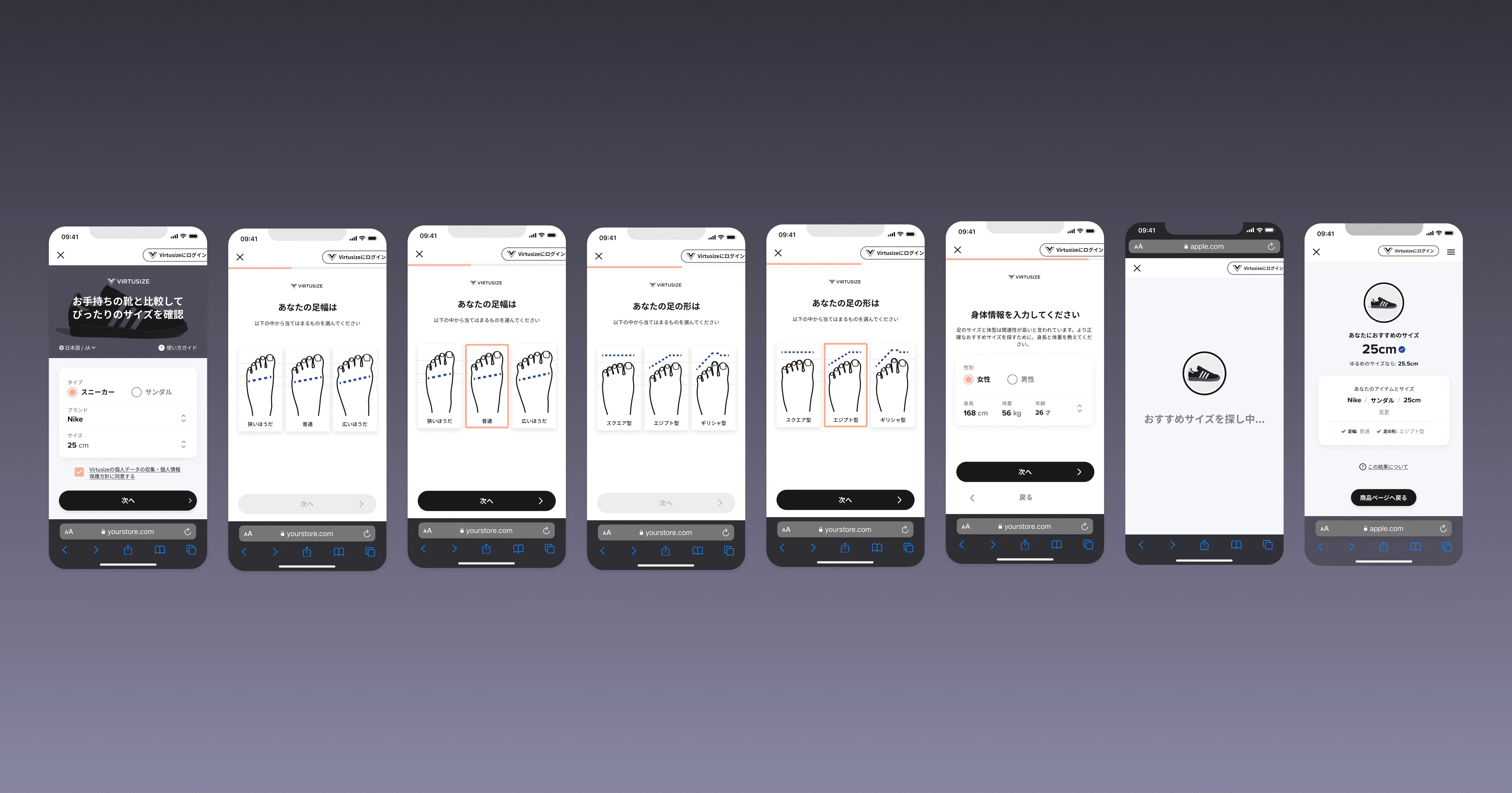
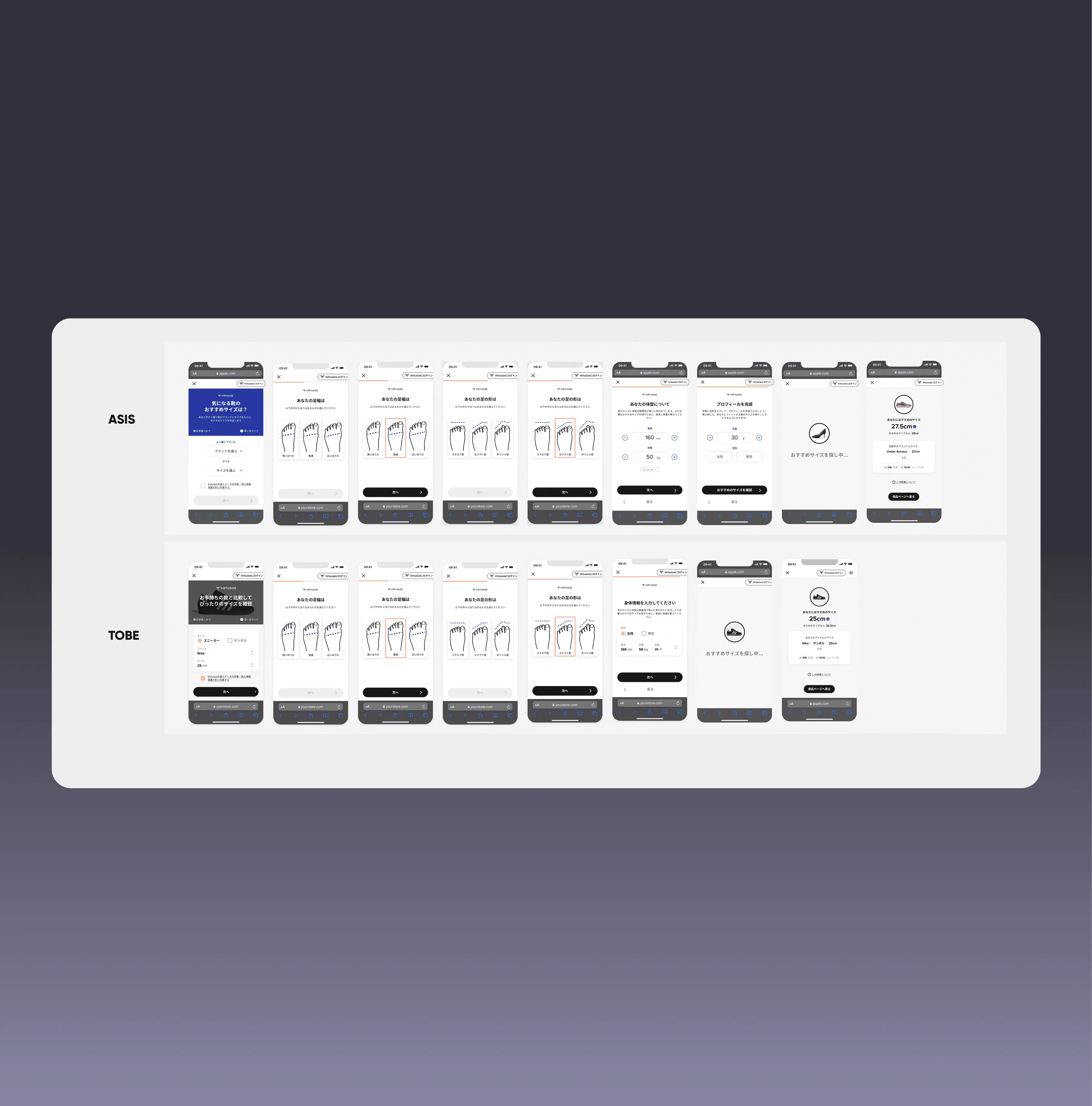
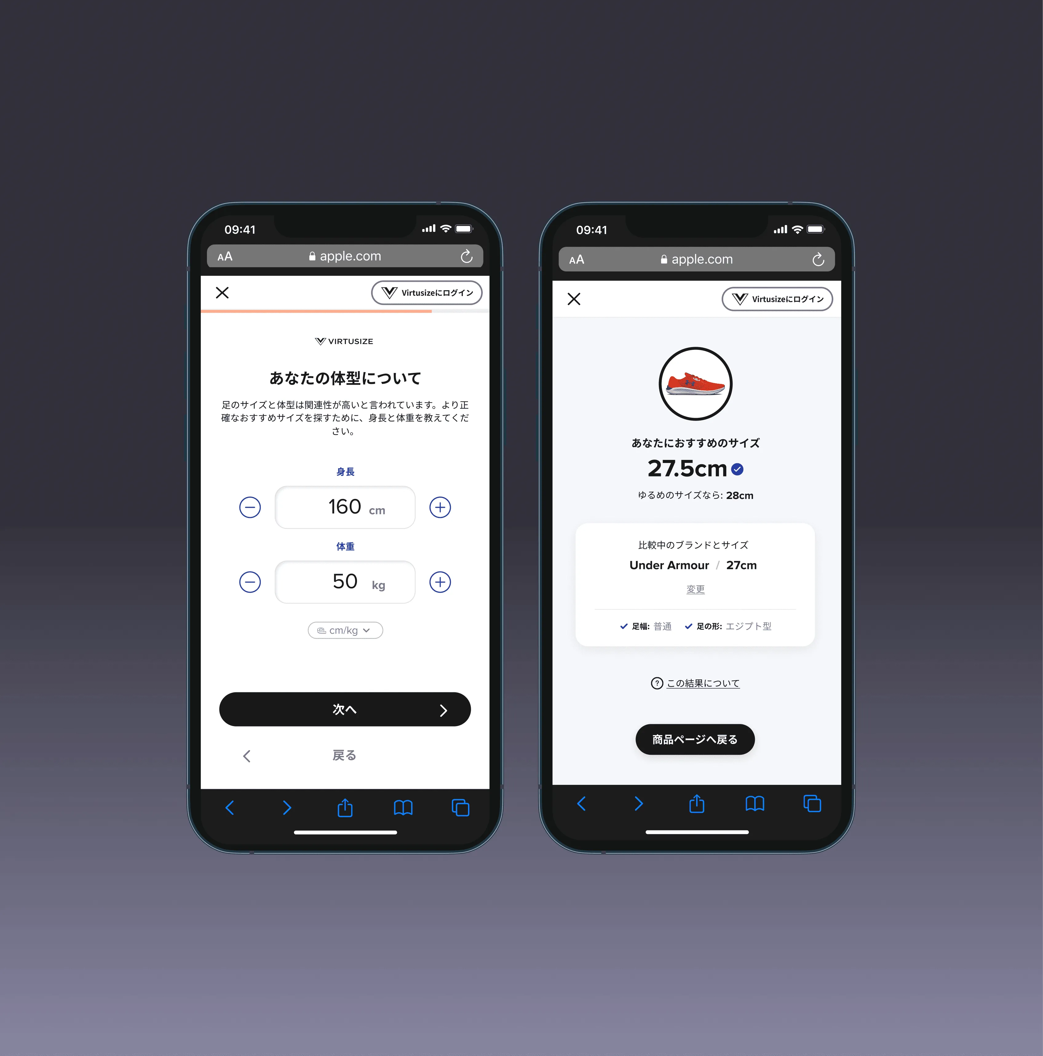
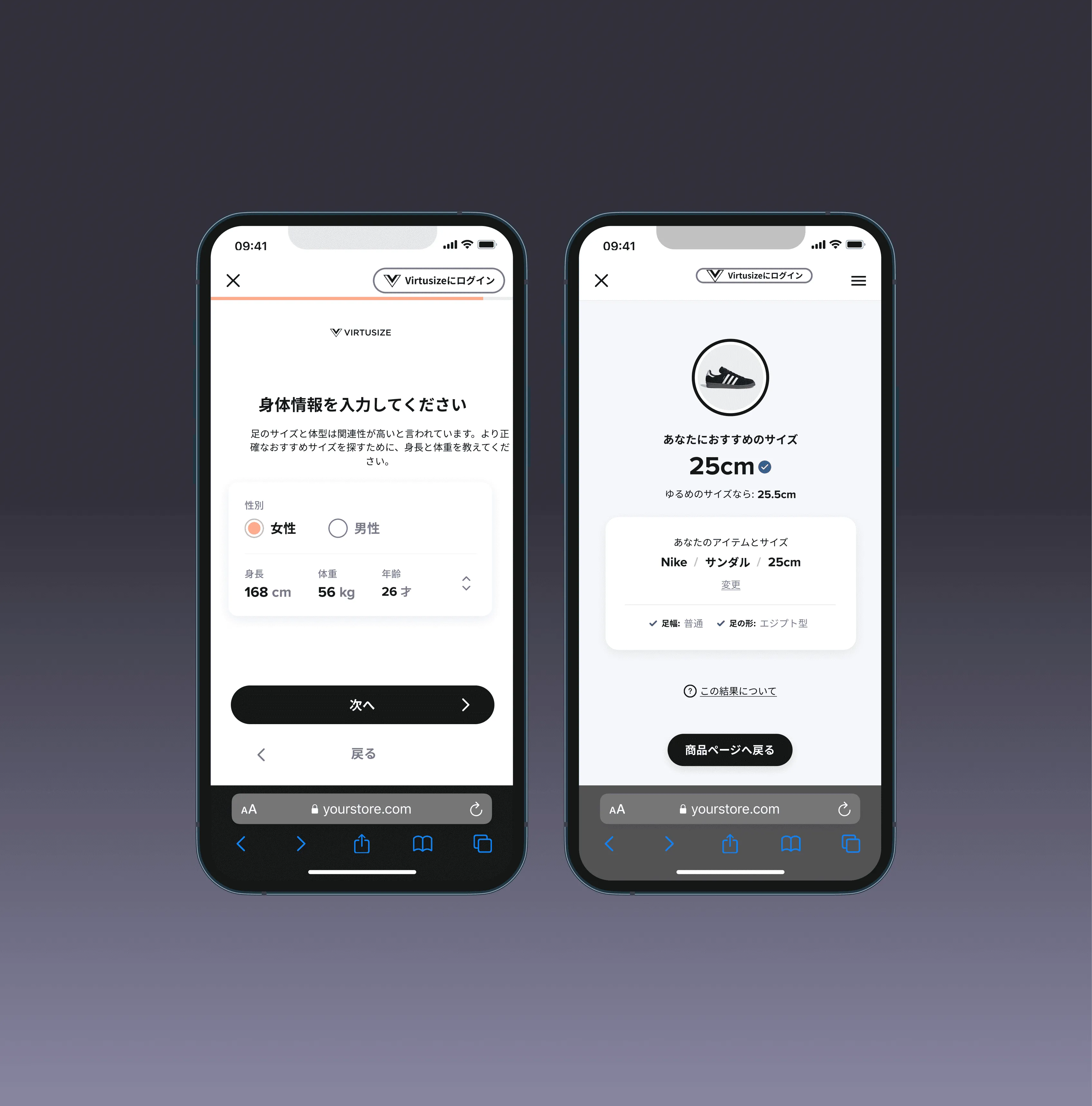
The existing widget asked for body measurements. Shoe fit is different: it's foot length, width, arch, and category-specific. The entire input model needed rethinking, without making the experience feel like a medical form mid-checkout.
And I had to do it with no research budget, no A/B test window, and a client that needed confidence.
What I Built
A shoe-specific input layer that adapted in real time to the shoe category being viewed. Sandal? Different questions than a running shoe. The widget felt like a conversation, not a form and surfaced only what was actually relevant to that purchase.
The flow was designed to remove friction at exactly the moment users were most likely to abandon: when size uncertainty hits.
Client feedback on launch: "Simple and easy to use. The flow and ease is a merit for both our users compared to competitors."
The Numbers
4.7% widget click rate for the shoe experience
3.4% increase in comparison usage (vs. 1.2% baseline)
1.8% overall conversion uplift
What This Case Study is Really About
Not shoe sizing. It's about refusing to take a brief at face value and having a design lead who gave me the space and guidance to do exactly that.
The research wasn't assigned. The insight came from a woman in Tokyo who'd given up buying shoes online entirely. No meeting would have surfaced that, but a design culture that prioritises user voice, set by my design lead, meant I knew it was worth looking for. The best decision I made wasn't a design decision. It was asking a question nobody told me to ask, in an environment built by someone who made that feel normal.
First project owning everything end-to-end. Biggest lesson: expertise isn't knowing the right answers: it's knowing when to stop assuming.